CoMotion 2024 Branding Team
Role: Design Team, Designer + Animator
CoMotion is a student-led motion graphics conferences hosted by MOMELove at SCAD. I worked in the design team making style frames for the main title sequence, pitched designs for Instagram grid posts, and designing + animating a looping panel background for presentation screens. It was an honor and a blast to be part of this talented team of 40 people.
Observational Chapter Animated Sequence
Design: Haze Nguyen, Cynthia Soe, Tiffany Tedy
2D Animation: Kai Lin, Lauren Neu
3D Animation: Phirada Kanjanangkulpunt, J.C. Petrofsky
Title Sequence Style Frames
I worked within the “Observational Chapter" which honed in on observation of nature, and systems and structures within nature: mitoses, DNA, the Fibonacci sequence. Inspiration for this section was drawn from scientific illustration, and the idea of someone analyzing components, working at a desk. With that in mind, there was a lot of use of gobos, fine texture and grain, and line treatment. There was a strong existing concept, but many unknowns about the composition and movement into animation. I did a lot of research to get the scientific textbook feeling and guide the compositions through iteration.
SH17 Final Style Frame
SH17 Iteration From Storyboard
SH18 Final Style Frame
SH18 Iteration From Storyboard
SH18 needed to change a lot from the storyboard. The note: Transition from DNA to the plant/leaves. The direction would continue to change based on proposals from me and the other designer, Cynthia Soe, working on this chapter
I proposed the following three compositions, featuring leaves, fern and branch theme. I leaned more heavily into notes and analysis feeling.
Without a set motion plan, I proposed composition that could change up the dynamics from SH17’s static set up
Final composition is chosen on the ease between the back to back frames, but more iterations would be done for subject.
Iteration with subject matter.
Iteration with scale, subject matter, introduction of circles which connects to the rest of the piece.
Adjustment on level of detail on main character versus supporting diagram details
Imagery from the storyboard was vague, so I was able to test out different compositions and research scientific components that I wanted to pull from
With the amount of diagrams in one frame, I introduced a grid structure to give structure and organize all the components.
Instead of following the storyboard, I decided to center the DNA to reflect the heirarchy that would be found in scientific illustrations
So much play with line weight of components, grid, lighting and texture.
Working within the same design language, I wanted to include diagram staples using the grid
Since this frame had no animation direction or connection to my previous frames, I pitched the idea of a slow rotations mirroring the action as the ferns would unfurl.
Pulling the consistency for line treatment of the shells and blurring the edges for focal point
SH23 Iteration From Storyboard
The focus on the golden ratio gave me a clearer idea how to proceed with designing this frame
SH23 Final Style Frame
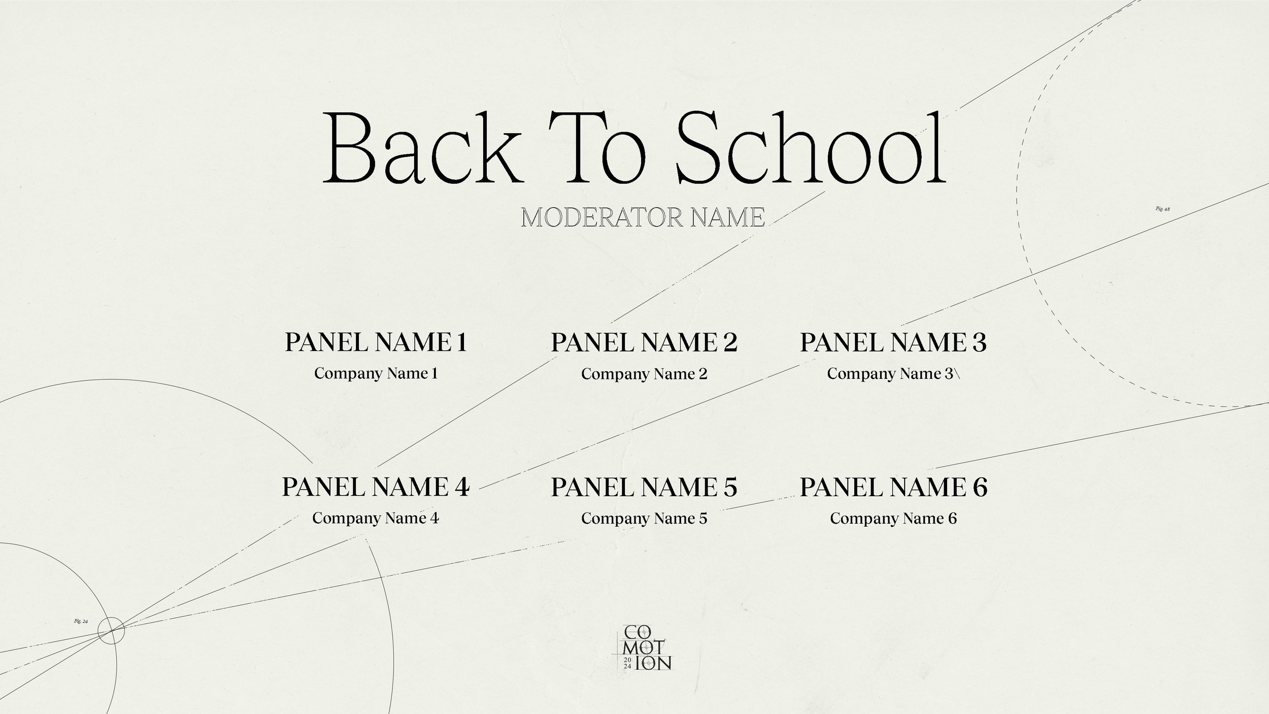
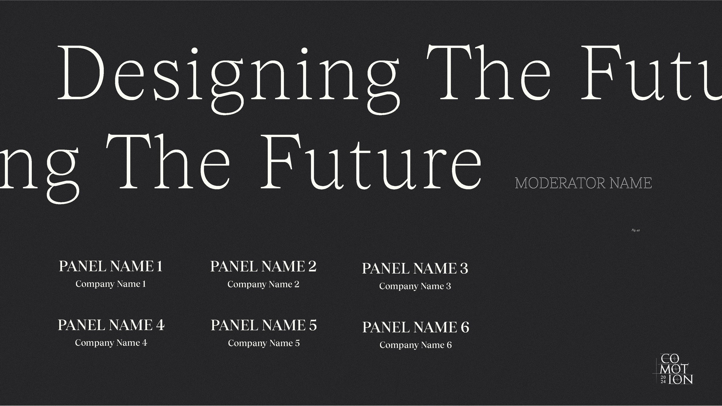
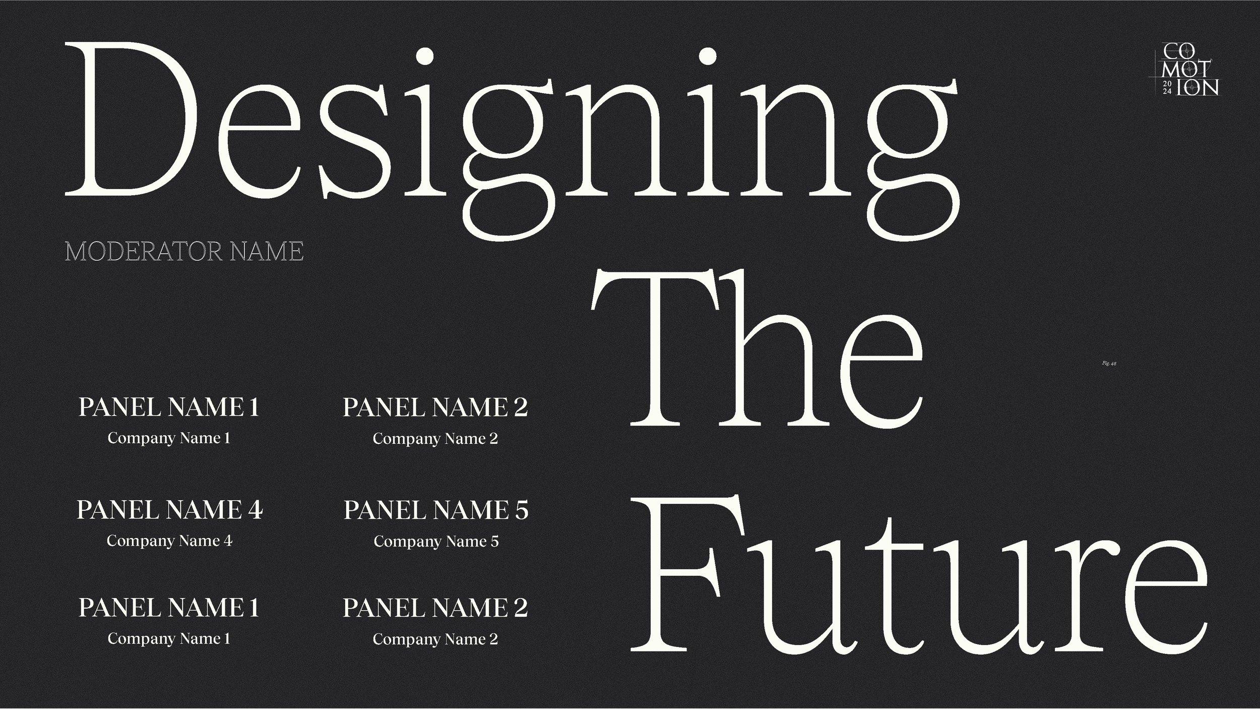
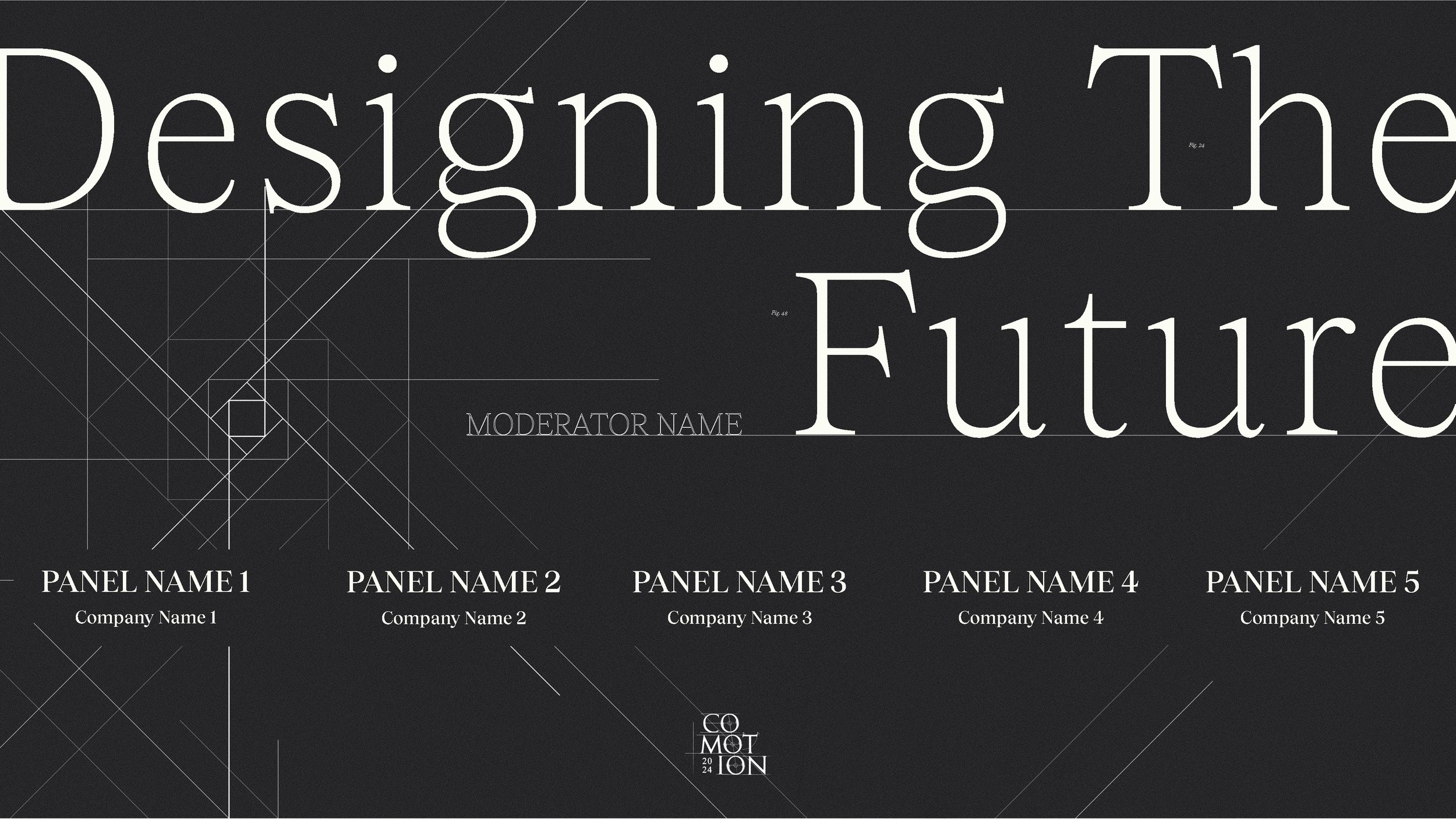
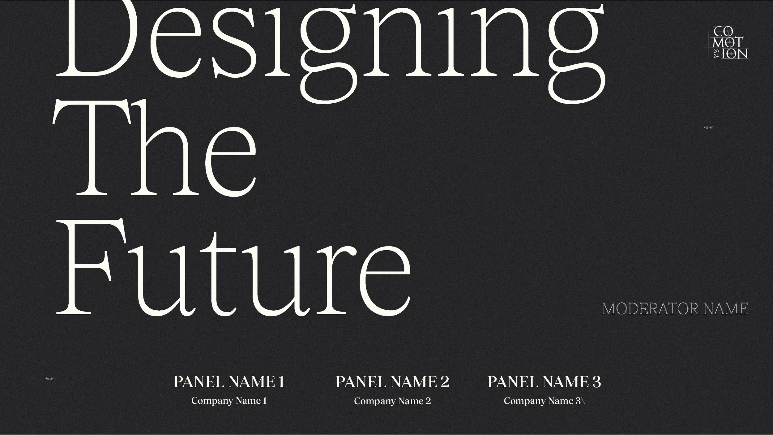
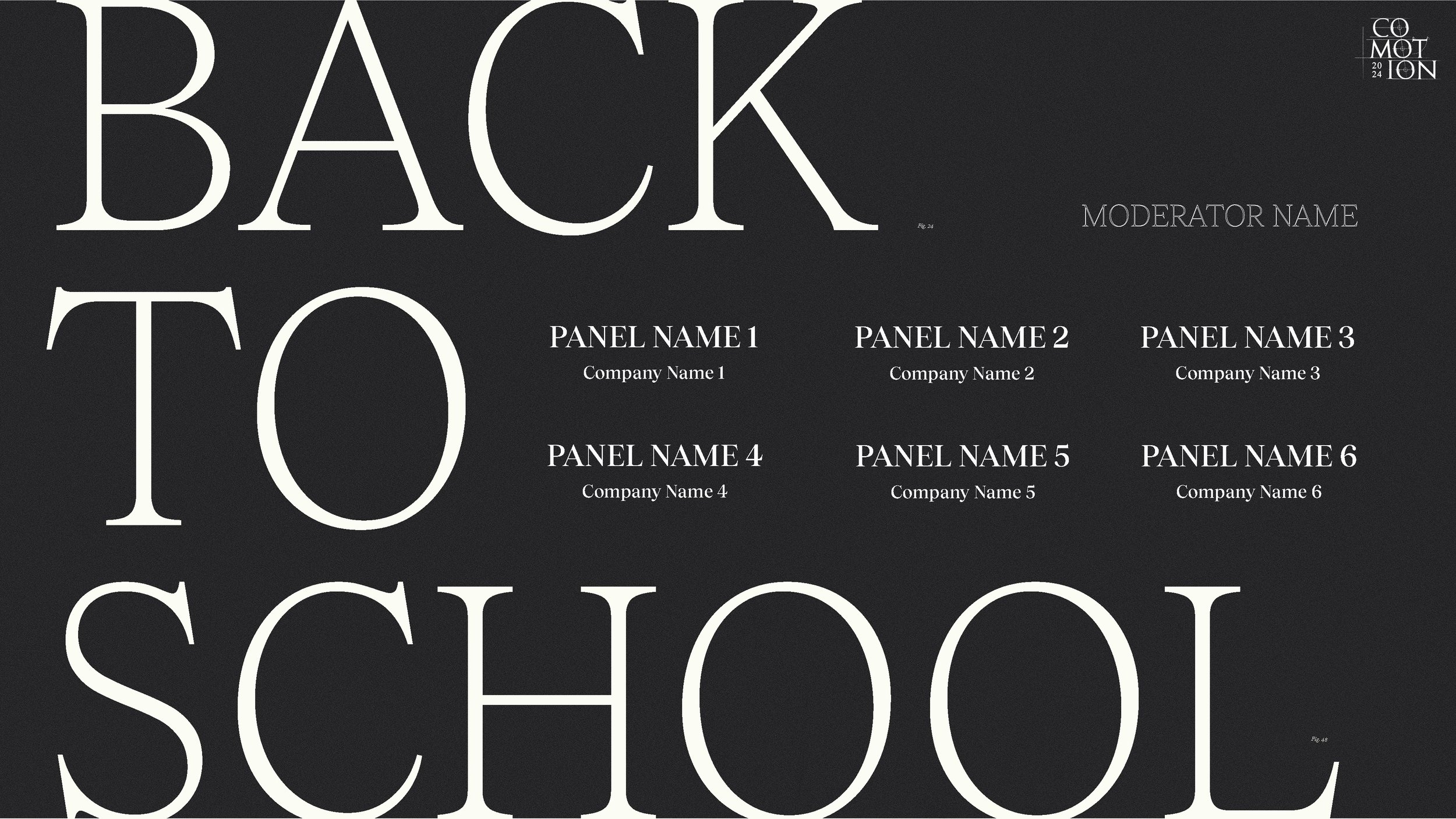
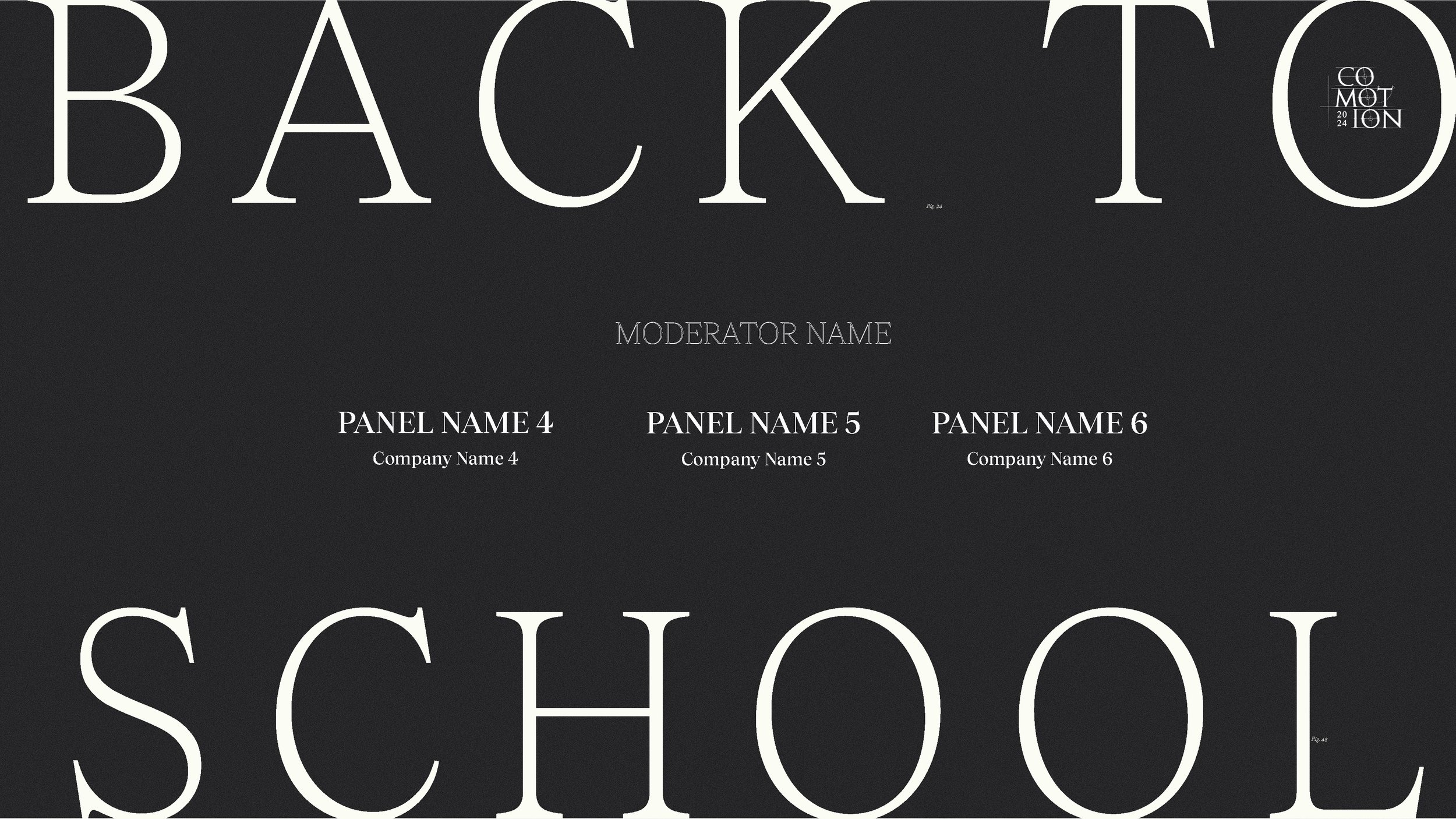
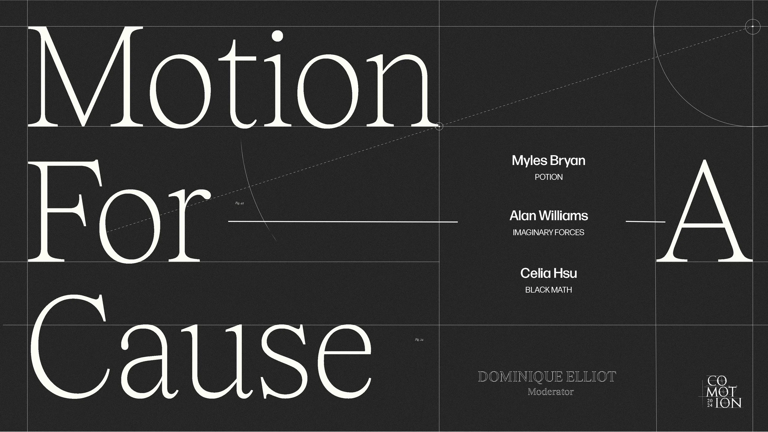
Looping Animation For Panels
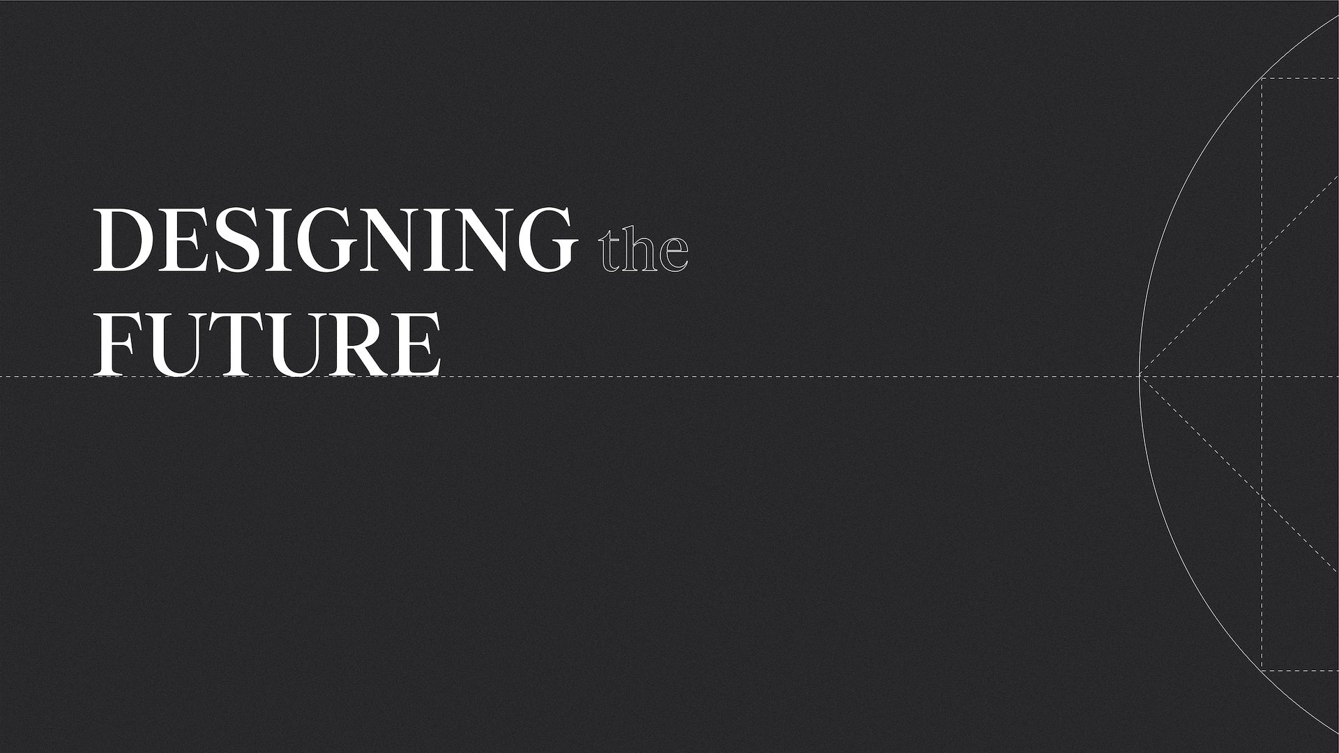
4K 10 Second animated deliverable. This was made to be looped and run on the stage screens for 50 minute panel discussions. I was in charge of design and animation of this deliverable. This would be following the design language of CoMotion overall, but needed to be very different from the title cards that the graphic design team had come up with. The design had to work interchangeably between the different panels with an unconfirmed number of panelist, so we made many variations. Some were very neat and centered, but we wanted to push the design more, so I tried large scale text, pushing text to the edge, realigning text. The final designs were modified considering the legibility and functionality of it being seen while chairs would be onstage. There was changing information, font and titles to consider as well as matching heirarchy of title, to panel/company and to the moderator information.
Instagram Grid Posts
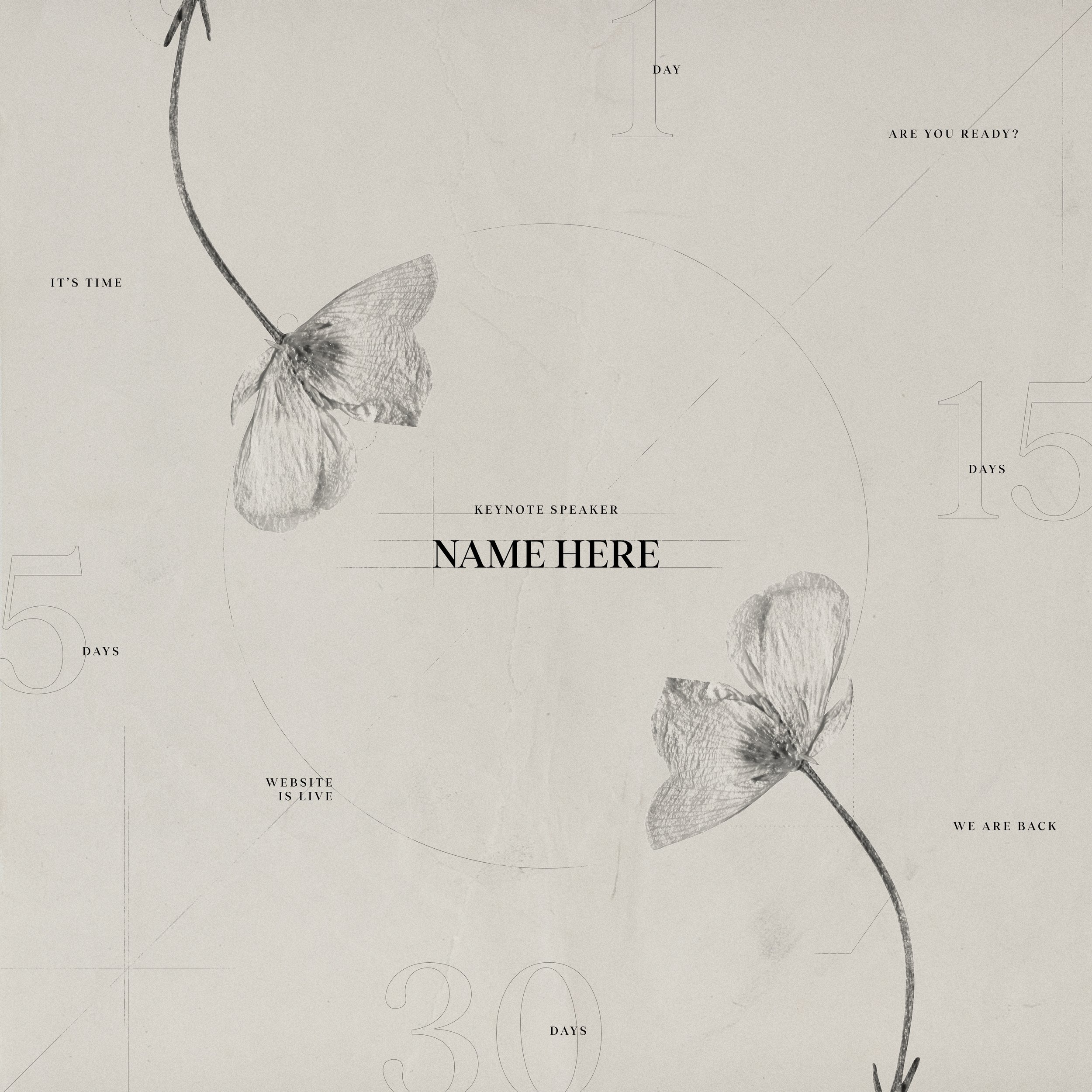
Instagram Grid pitches were encouraged but not required by design team members, the winning pitch design would make up the 9 posts leading up to CoMotion. Most of the CoMotion deliverables were based on graphic designs clean look, but we had not had many pre-event teasers that hinted towards other chapters of the original concept. Working with the observational chapter, I pitched these designs that played with line weight, stroke of the text for count down days, but used the organic analysis look to draw the eye to the most important information: the keynote speaker announcement. While I got a positive response from the directors with the idea of showing off different sides of CoMotion, in the end the animation split between people would be more difficult, as each standalone animation of the nine total would need to carry it’s own interest.
Full Credits
Creative Director: Kyle Switzer, Muskaan Sethi
Lead Animator: Isabelle K Winarto
Animators: Jiaru Yang, Lauren Neu, Linxuan Wang, Sean Shelton, Tzu Kai Lin, Valentina Gil Duque, Xinyue Gu, Davis Hardy, J.C. Petrofsky, Phirada Kanjanangkulpunt, Qi Qi
Lead Designer: Tiffany Tedy
Designers: Xinxun Liao, Phyllis Zhao, Haze Nguyen, Danna Macias, Cynthia Soe, Chaoran Xu, Sarah Wellman
Lead Graphic Designer: Reem Hinedi
Producers: Rachel Golla, Alexis Dow
Graphic Designers: Aatreyi Singh, Alessia Piccoliori, Charlotte Beck, Claire Lin, Emily Strycharz, Gauthier Bossuyt
Producers: Punasa (Bee) Sihsobhon, Sophia D’Alleva
Experiential: Eliezer Garcia Gazaui, Jinkyu Kang, Gabriel Medina, Hannah Ford
Web Developers: Amadeus Cameron, Chi Quach
Composer: Seth Marques

