
Drink Masters Title Sequence & Branding Toolkit
Recognition:
International Design Award 2023 - Silver in Multimedia Animation, Bronze in Multimedia Broadcast Design
Red Dot 2023 - Brand and Communication Design Award Winner
Drink Masters is a series on Netflix featuring the best bartenders in competition to find the most accomplished mixologist. The show is intense, competitive and features beautiful cinematography of artistically decorated cocktail presentations. This title sequence takes you through the liquid abstract makeup of the winning drink and sets the tone for the show. Portraying an elite feeling with the clean visual, but including a building sense of chaos and rising tension to reflect key points in the show. This sequence showcases all the behind the scenes of what goes into a perfect drink.
Title Sequence
Initial Storyboard

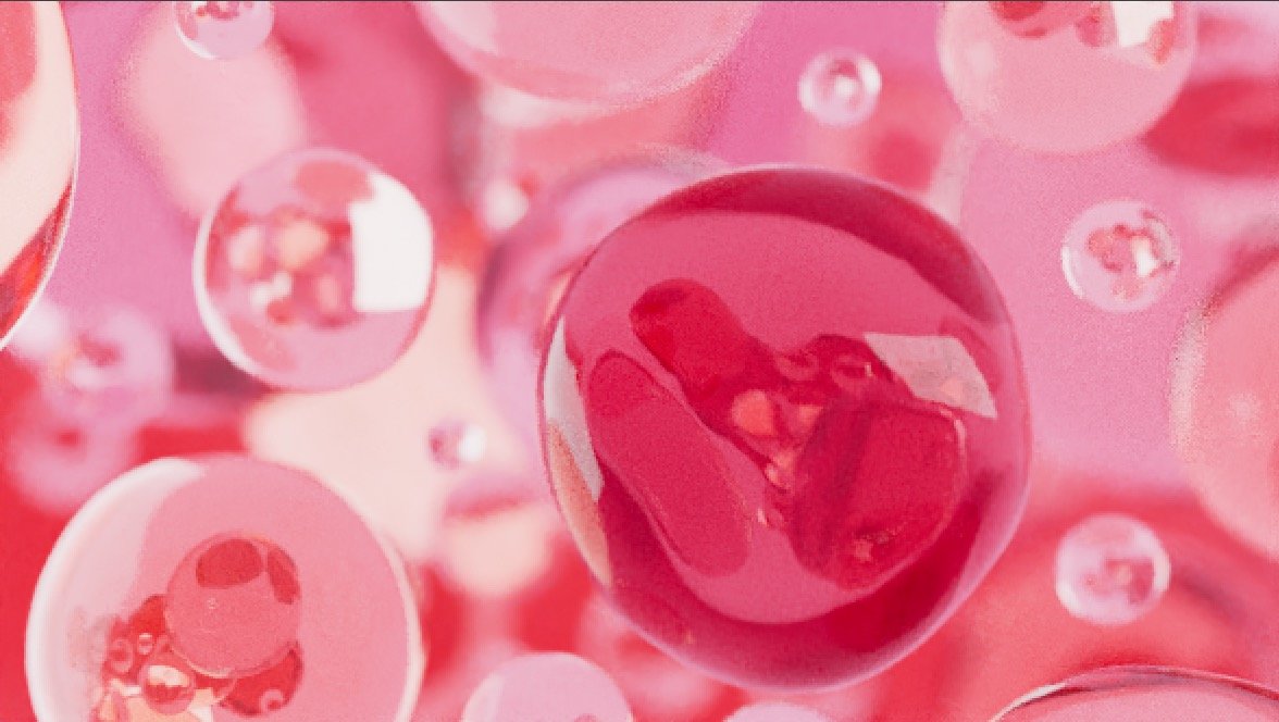
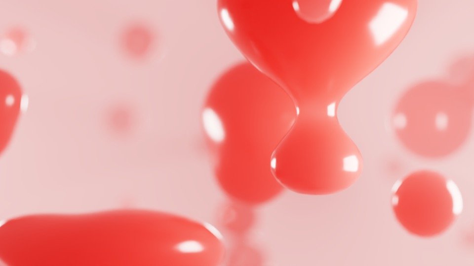
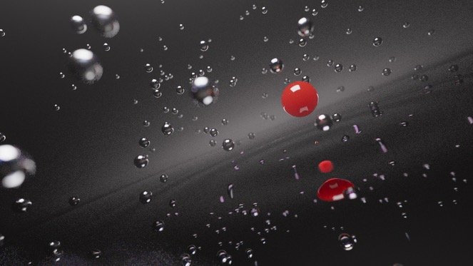
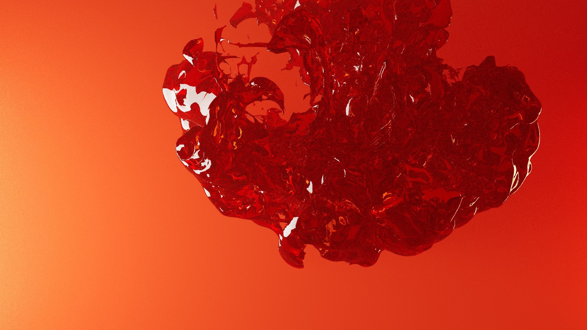
Raw Style Frames


Collaboration & My Role
This project was a collaborative one with my classmate J.C. Petrofsky. My role in this project leaned heavily in concept and direction, as well as studying up in C4D to execute shots in a style that I do not specialize in.
Direction
The initial storyboard highlights different abstract scenes that take place before the final drink reveal. I suggested the idea of an underwater soundscape mixed into the audio paired with music that builds in intensity. The purpose was to reflect the show accurately in energy, and give the sense of immersion for viewers to understand the abstract scenes.
I pushed for the color story of the piece to start from a deeper red while within the depths of the drink, transforming the hue to orange as the viewers break through the surface towards the light and final review.
Initially there was only a set of equal abstract scenes through the drink, but considering the intensity of the show I decided to work on later scenes to create a stronger build to the reveal by using pyro simulations rather than basic subtle motion that was used in the beginning.
Cinema4D
While I know the basics of Cinema 4D, I do not typically work in this program while designing. I was responsible for the second half of the style frames. I felt that there was more variety to work on between modeling the plates, glasses and type. I spent time working out the lighting on the glass, and camera framing for the end. I did lots of research to get the pyro simulation working, and manipulate it to fit our project. Of course, I asked for help and guidance from people who are more familiar with 3d, but I went head first into learning this workflow because I knew that this project needed this look.


Working With Color and Composition
Liquid Material + Lighting Tests (One of Many)

Starting Out Lighting …


Lighting Glass and Liquid
My PyroSquid Companion
Early Look Development
Revised Look
Branding Toolkit
Branding deliverables for Netflix show package that I was responsible for. This includes a mortise, the lower third, bump in/out and the end title. Setting the assets to make the look cohesive among the show package is essential in branding so we manipulated a movable 3D imitation bubble that could be animated.
Mortise
Bump Out
Lower Third
Bump In
End Title
Early on, one of the challenges we faced was highlighting the fruity and bright elements of the cocktails from the show, but there was a huge risk of it looking too soda-like or geared towards feminine products.
To avoid the commercial look, we turned towards a darker look. I still believed color is an important feature, so I suggested a rich and bold palette, using orange as the focal point which also served as a strong branding color. This still fit into the elitism of Drink Masters existing production.
Early Creative Challenges


While the color shifted it was important to create uniformity through texture and use the color to tell the story. Instead of starting in darkness, the color would show beginning from the depths of the drink at red-orange and becoming a richer yellow-orange as the viewers “rise” out of the drink. Having the environment stay away from gray and black kept it more immersive in the drink rather than just suggesting elements of a cocktail.
For the texture, the concept of carbonation and focusing on bubble qualities tied all the frames together. Considering transparency, reflection as well as how water ripples were tested over and over in C4D to create cohesion.

